Meals get decided by what’s already at home, not by a plan.
A SOLO PRODUCT DESIGN CASE STUDY · 2026
A meal planner for students
learning to cook for themselves.
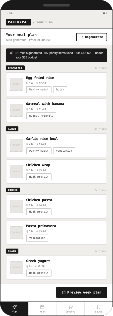
I designed PantryPal to help students plan meals around what they already have, how much they can spend, and how long they want to cook.
- ROLE
- Solo product designerResearcher
- TIMELINE
- Jun–Jul 2026
- METHODS
- User interviewsEmpathy & journey mapsWireframingThink-aloud testingHeuristic review
- TOOLS
- FigmaBalsamiqMiroMural
01 / THE PROBLEM
Cooking while keeping up with classes
Meet Sam. She’s an undergraduate living on her own for the first time.
She needs a simple, reliable way to handle meal decisions so she can stay healthy while balancing school. Planning meals, shopping, and staying on budget takes time—and leads to wasted food, especially for students who never cooked before leaving home.
THE DESIGN CHALLENGE
How could I help students plan meals without adding more work to their week?
02 / RESEARCH
What students told me
3DISCOVERY INTERVIEWS
2USABILITY TESTS
PEER REVIEW
Heuristic
peer review
WHO I INTERVIEWEDSophomore, lives with 9 roommatesJunior, apartment near campusSophomore, shares a 2-bedroom with 5 roommates
Recipes come from TikTok, saved but rarely organized.
Cleanup, not cooking, is the most-cited frustration.
Food going bad and cramped shared fridges shape what gets bought.
Shoppers buy the same staples every trip; new recipes feel like effort.
03 / FROM INSIGHT TO DESIGN
What I changed based on the interviews
01 / What I heard
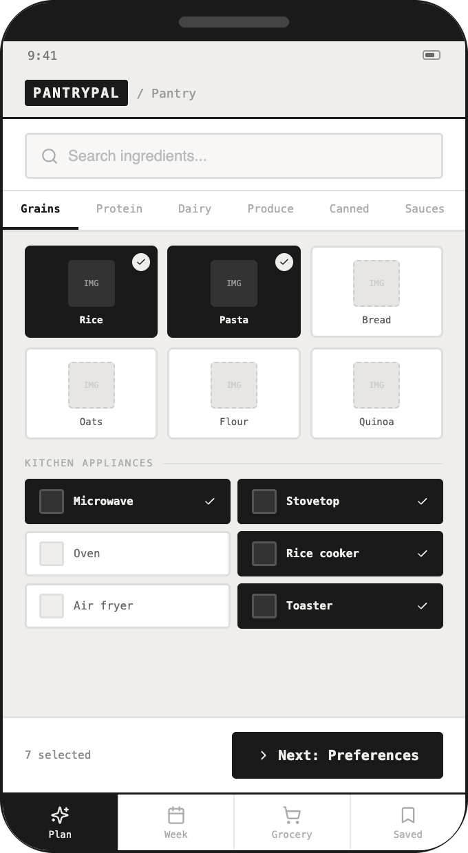
Typing in ingredients is a chore
What I designedCategory-tabbed pantry checklist with search
02 / What I heard
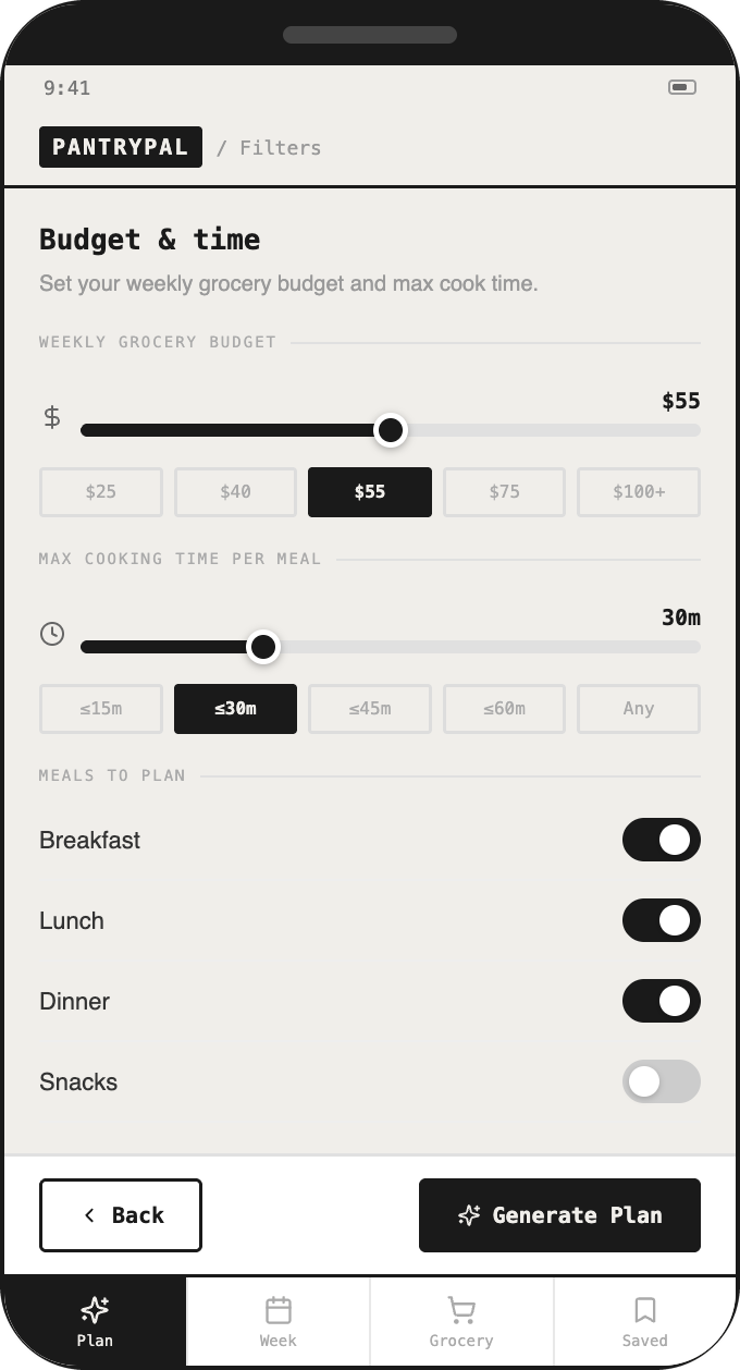
Time and cleanup matter most
What I designedMax cook time per meal + quick-meal preference
03 / What I heard
Budget drives every decision
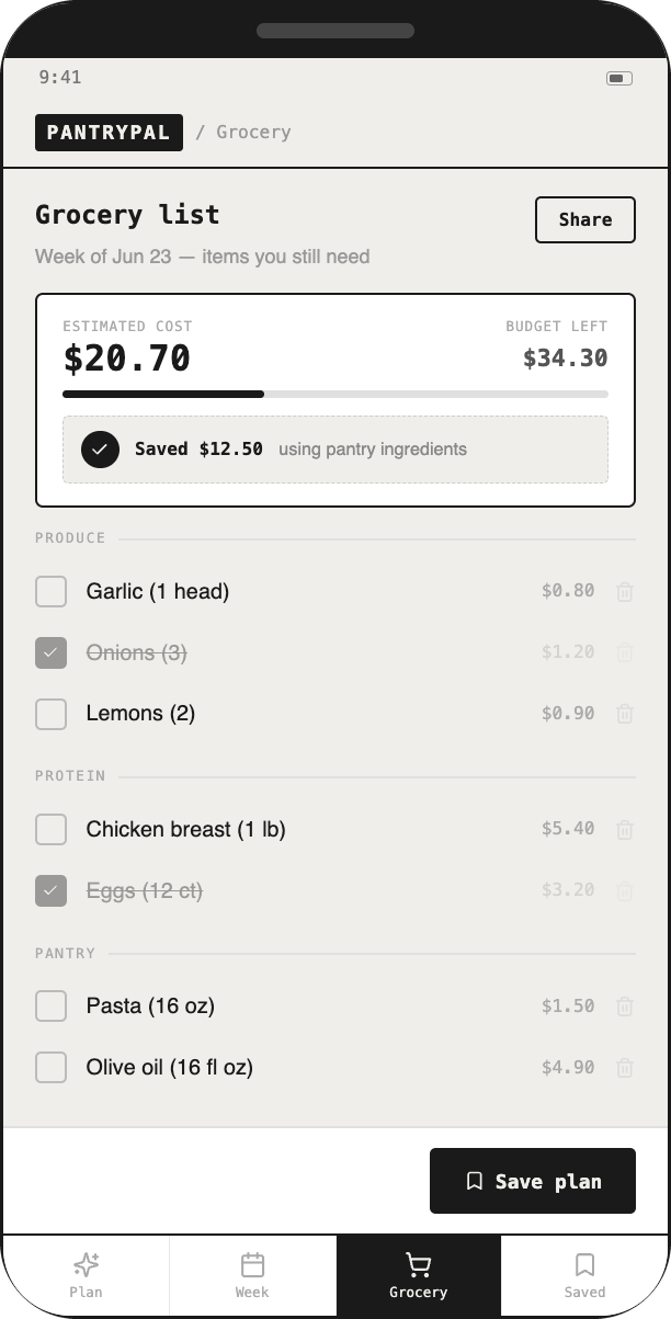
What I designedWeekly budget slider + cost-estimated grocery list
04 / What I heard
“Why did it pick this?”
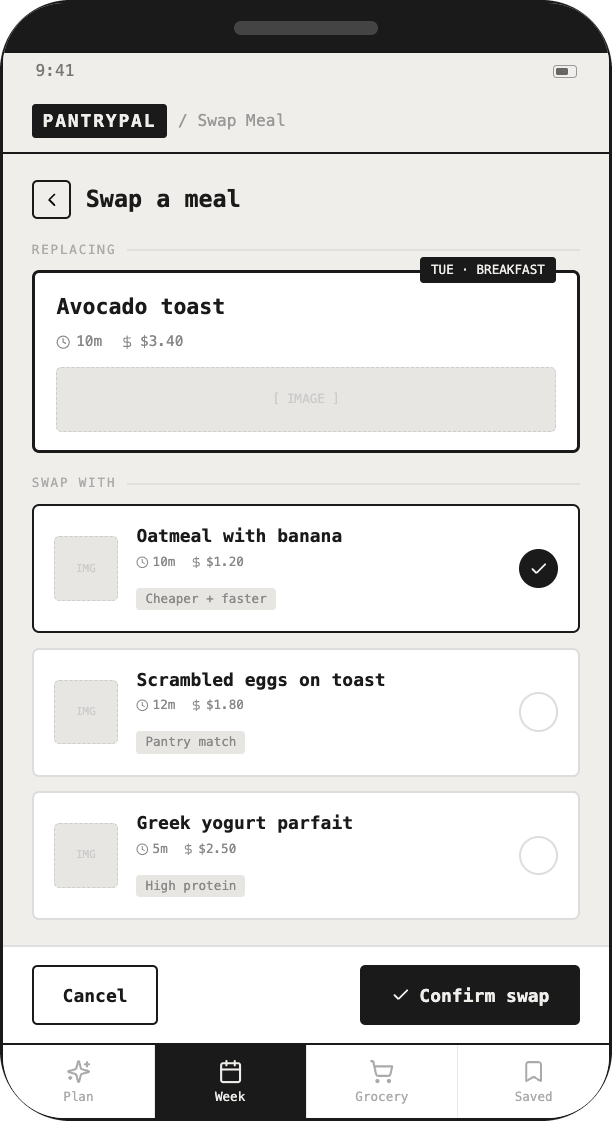
What I designedTags on each meal: Pantry match, Budget friendly, High protein
05 / What I heard
Plans need flexibility
What I designedOne-tap meal swapping
06 / What I heard
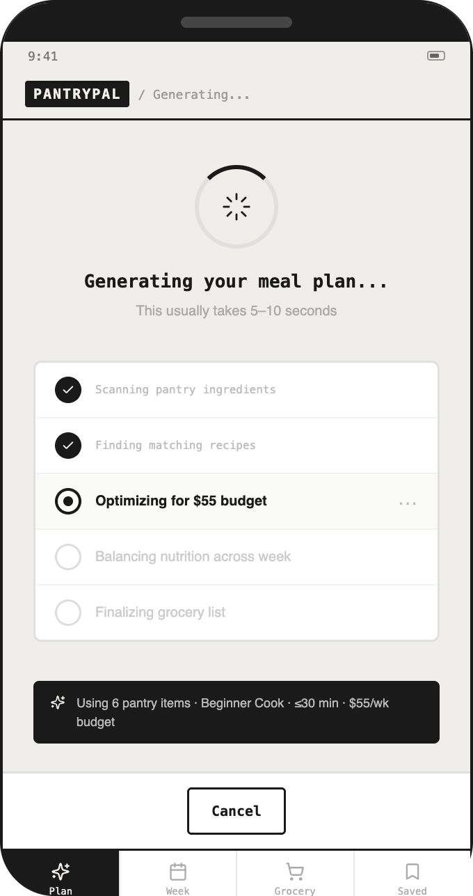
Waiting feels uncertain
What I designedA generating screen that shows each step
04 / THE DESIGN
Open the prototype (toggle V1 / V2). The nine-screen wireframe flow
01 / 09
Building the brand


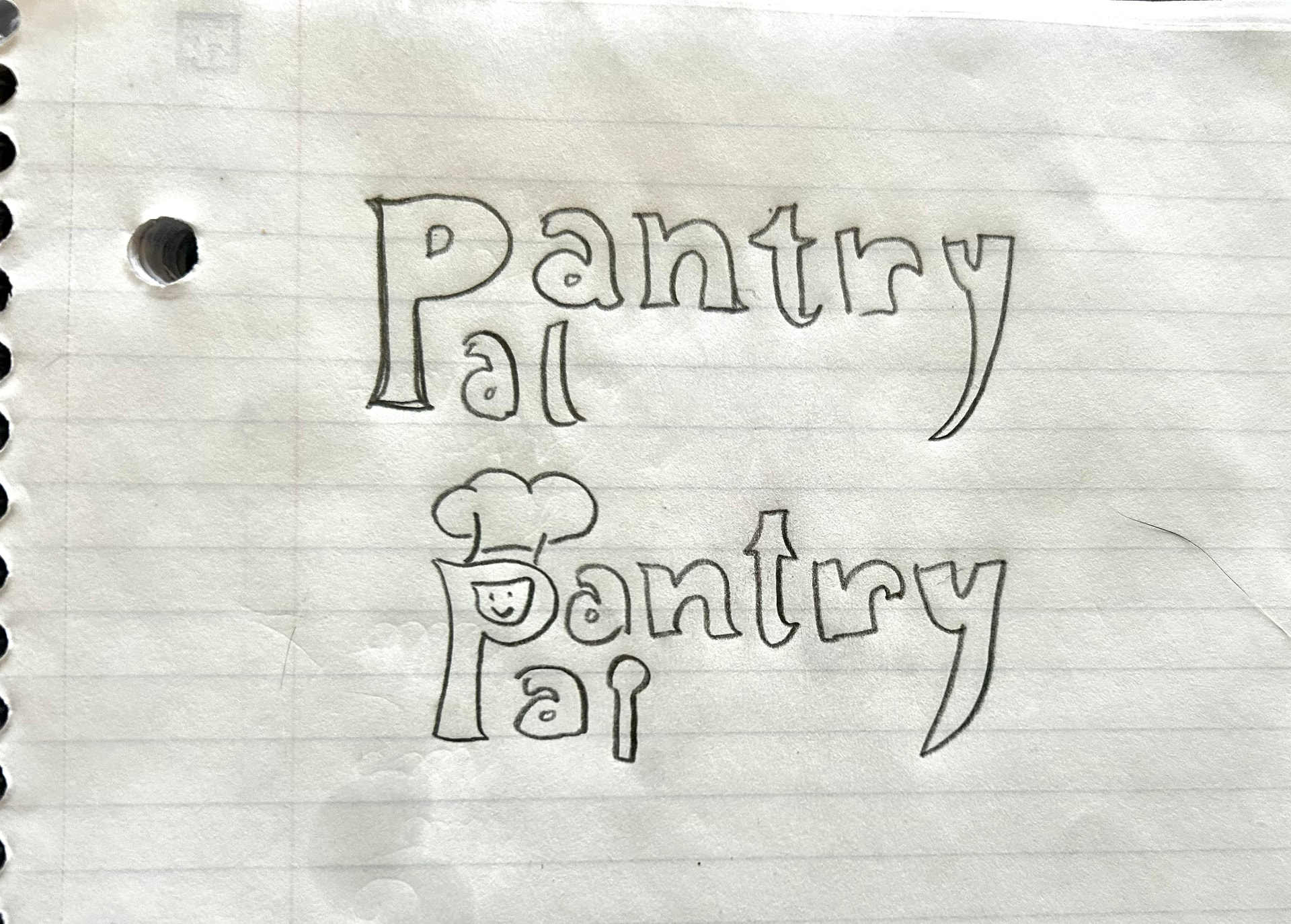
I named it PantryPal because it felt warm and welcoming, like a friend helping you through the switch to cooking for yourself. Since both words start with P, I stacked them so they share one letter, and that shared P became the mascot. I sketched it by hand, then refined it in Adobe Illustrator.
The greens feel clean and fresh, while the blue and orange add energy and make it feel youthful.
Bugaki
Bricolage Grotesque

05 / COGNITIVE SCIENCE
Why I made these design choices
Reducing decision fatigue
The app drafts the week; users only edit.
Recognition over recall
Tick familiar ingredients instead of remembering and typing them.
Feedback and visibility
A progress screen and “why this meal” tags make the app’s reasoning visible.
06 / USABILITY TESTING
What happened in the usability tests
MODERATED THINK-ALOUD TESTS
“It’s the start of finals week and you’re planning groceries.”
The tasks
Enter pantry & appliances, set preferences, create a grocery list.
The hypothesis
Setup might feel too long; users would question where recipes come from.
Both participants understood the concept immediately and finished within minutes; meal swapping was a favorite.
One participant wouldn’t use it because he already manages fine. This sharpened my target user to less-confident cooks.
Friction / Grocery list
Reaching the final grocery list took too many screens—the biggest confusion.
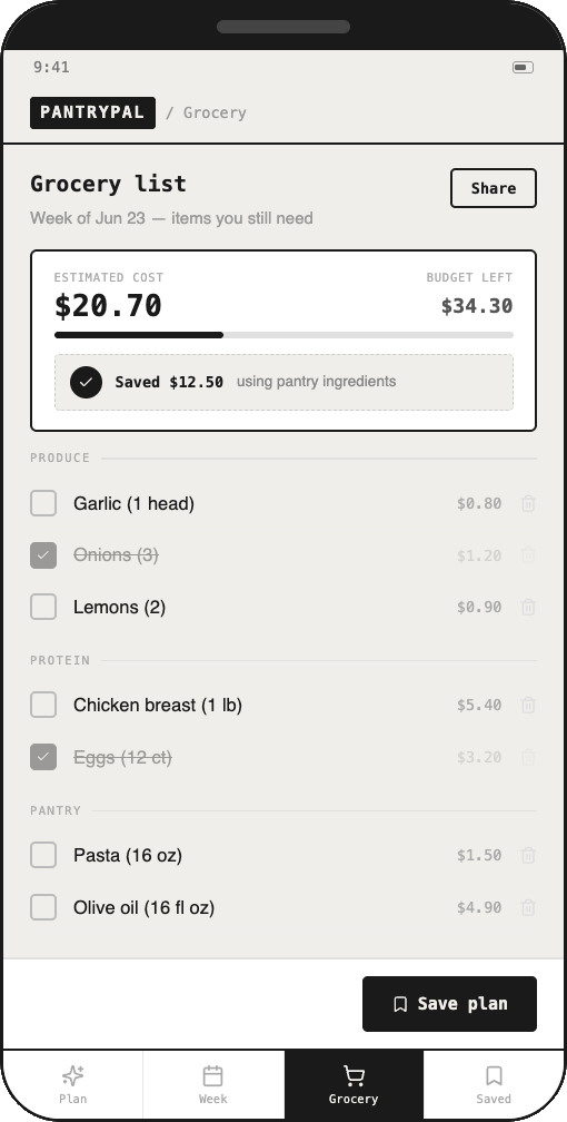
A “Saved $12.50” label didn’t read as savings.
Friction / Pantry
Pantry category tabs were overlooked.
Users wanted an “Other” option for appliances, cuisines, and allergens.
I expected pantry setup to be the hard part. The tests showed me that getting to the grocery list was the bigger problem.
Heuristic peer review
DiscoverabilityProgress indicator
AffordanceMeal notes
MappingSync slider and preset buttons
ConstraintsBudget warning
07 / ITERATION
What I changed
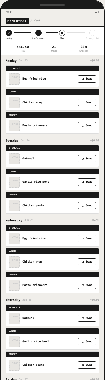
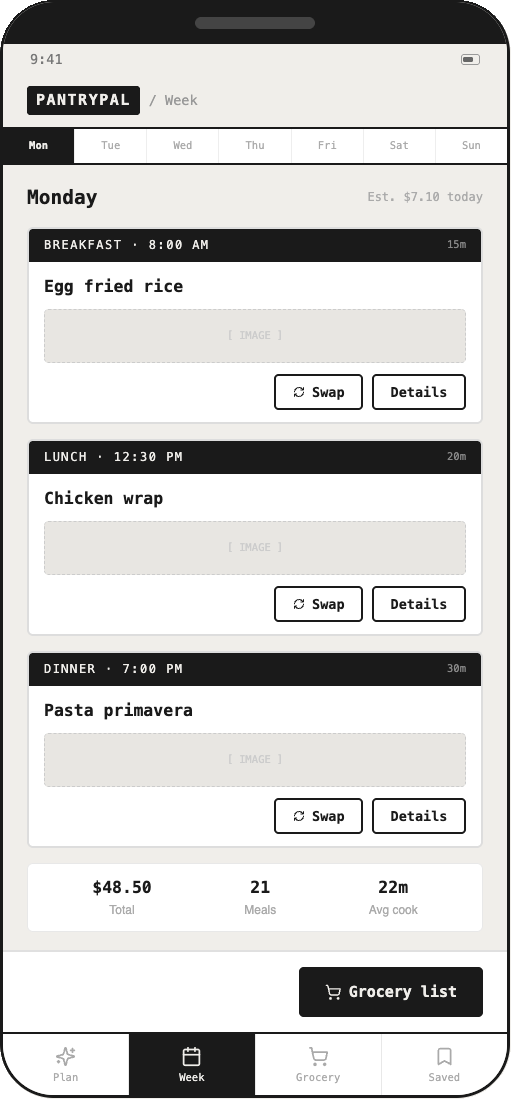
Weekly plan
Before / V1
After / V2
Testers expected to see the whole week. I replaced day tabs with one scroll, so all seven days are visible at once.
Path to the grocery list
Before / V1
After / V2
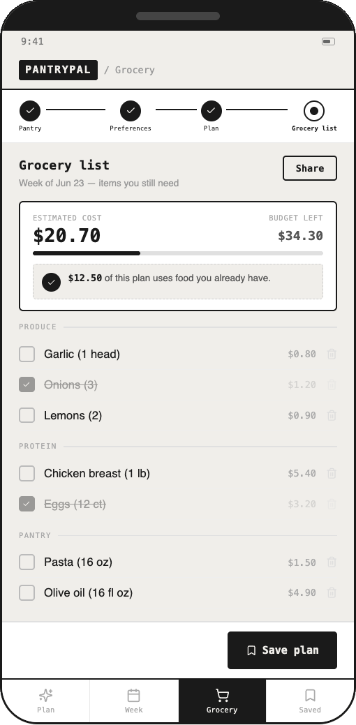
The biggest confusion was reaching the list. A 'Build grocery list →' button now goes straight there from the plan and the week view, and a 4-step progress bar shows where you are.
Savings label
Before / V1
After / V2
'Saved $12.50' didn't read as savings. It now says '$12.50 of this plan uses food you already have.'
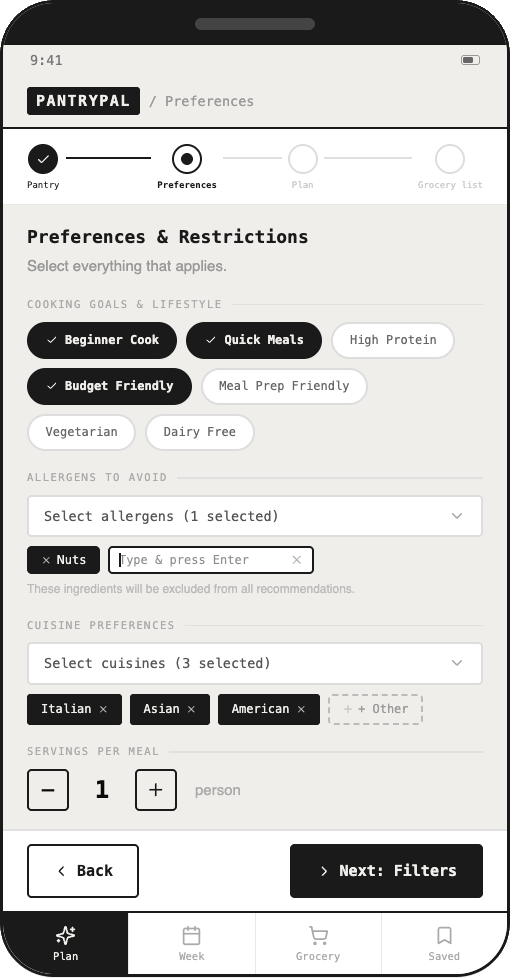
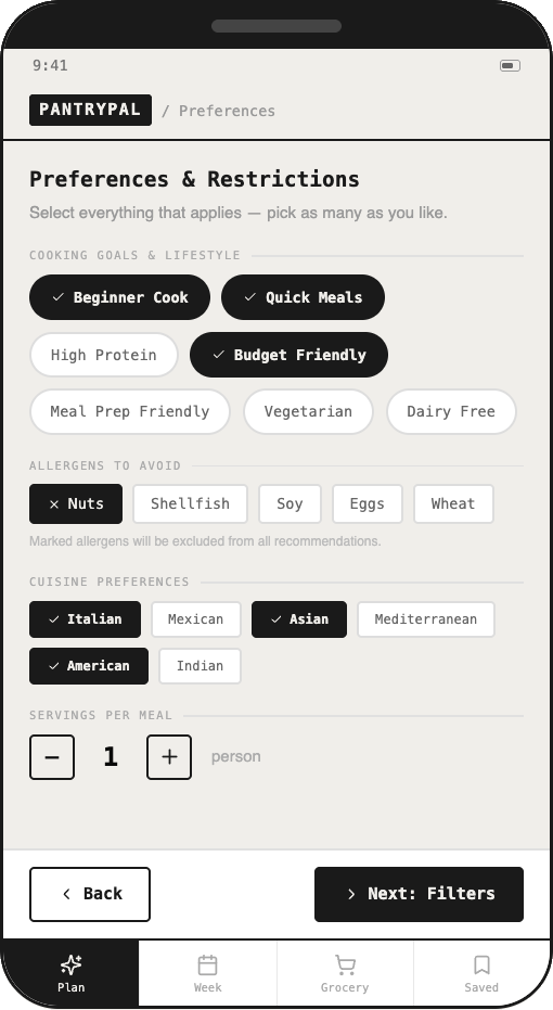
Preferences
Before / V1
After / V2
Testers wanted an 'Other' option. I added '+ Other' to appliances, cuisines, and allergens, and moved long lists into dropdowns so the screen stays clean.
I also replaced the inverted black pantry cards with clear checkboxes, so selected items are easier to see at a glance.
Task success: before → after
Time-to-list: before → after
08 / SCOPE DECISIONS
What I cut, and why.
Recipe import from social media
Scraping recipes is unreliable and restricted.
User accounts
Accounts added friction without testing value.
PANTRY PLAN GROCERY LIST
I focused on the core loop.
09 / PROPOSED SUCCESS METRICS
How I’d measure whether it helps
Plan-to-list rate
% of plans that become a grocery list
Pantry usage
Use of ingredients already at home
Retention
% of users who plan meals in consecutive weeks
10 / REFLECTION
What I learned
My biggest assumption was wrong.
I expected the manual pantry setup to be the pain point. Testers got through it easily; where they got lost was the path to the grocery list, the feature they cared about most.
Words are part of the design.
I labeled a feature “Saved $12.50,” and a tester didn’t see it as saving money at all. A label that made sense to me didn’t match how users think about money.
A “no” is useful data.
One participant said he wouldn’t use the app because he already manages fine. That helped me narrow my real user to less-confident cooks rather than every student.